# How to Use Fully-Fluid
Formats determine the overall size and behavior of an ad. Think of a format as the *container* that defines how your ad will look and act on different devices and screens.
Fully-Fluid™ is a type of format, whose layouts are infinitely adaptable to a range of sizes.
Fully-Fluid™ ads can also adapt to infinite layout arrangements; that is, the responsive nature of the ad allows it to automatically choose from an array of layouts composed of different elements that you created.
### Design Without Breakpoints
Previous iterations of responsive ad design relied on breakpoints to tell the ad server which preset ad layout to choose.
**Breakpoints are exact points, width and height, that must be set up in advance**, to trigger the correct layout choice from an ad server.
However, a Fully-Fluid™ design **doesn’t require breakpoints**.
#### How it works
* Fully-Fluid™ format **bundles a group of layouts** in a range of sizes and deploys them as a unit by using the different aspect ratios of those layouts.
* Bundles include a **minimum of 3 layouts** (horizontal, square and vertical shapes) that are the three core aspect ratios.
* ResponsiveAds has set, by default, **five key shapes**: a max size **horizontal (10x1)**, **square (1x1)**, **vertical (1x4)**, **landscape (16x9)**, and **portrait (10x16)** shape.
* This **range of sizes** and styles can be deployed selectively into different ad slots using **a single tag**.
* Once deployed, the ad slot from the first-party ad server will be called upon to indicate **which size from the packaged group** should be delivered.
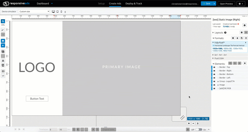
### Layouts in Fully-Fluid™
**Layouts are the precise arrangement of images, text elements, logos, and other elements in a given ad unit** (Creative), related to a given size (width x height).
Responsive ad displays choose which layout of a Creative is appropriate for a given context.
#### Key design concepts
To design effectively in the Fully-Fluid™ format, elements must be anchored, contained, locked, and grouped effectively.
**Anchoring Elements**
**Anchoring** elements pins an element to the canvas at one of nine fixed points.
To see a demonstration of element anchoring, watch [this RAD Academy video](https://www.youtube.com/watch?v=xmLs2dG6RvU\&list=PLoKRmtEBrymyiYOIgRhhEmMcBMCIjhTPV\&index=7).
**Containing Elements**
**Containing** an element sets that image or icon within a container, which lets you manipulate that element in a way that prevents the element from skewing when the fluid format shifts.
A continued element can fill or cover its container. For more detailed information, see: *Elements - Containing (coming soon)*.
**Locking Elements**
**Locking** an element maintains its proportion within its container.
For more detailed information, see: *Elements - Locking (coming soon).*
**Grouping Elements**
**Grouping** elements lets you to manipulate diverse elements as a single set, which lets you standardize applied actions across all elements in the group.
For more detailed information, see: *Elements - Grouping (coming soon).*
### Fully-Fluid Templates
You can also use a pre-loaded Templates, whose ratios are set using the best practices for Fully-Fluid design.
To better understand Templates, see *Templates Overview (coming soon).*
### Applying Fully-Fluid™ format
The **range of sizes** and styles can be deployed selectively into different ad slots using **a single tag**.
Once deployed, the ad slot from the first-party ad server will be called upon to indicate which size from the packaged group should be delivered.
Due to the infinite range of variants available, the exact, clean, correctly sized layout will be the one seen by the user at any given time.
#### Emma's Notes- Fully-Fluid design best practices
The key difference when doing Fully-Fluid design is that you are defining a set of sizes relative to each other, instead of just single sizes that can shrink or grow proportionally to fill a slot.
The ad will adapt according to the rules you set up, so that it changes fluidly between each size, instead of being fixed to what you set up in a specific size.
As all the elements added to your creative are available for all your sizes (instead of duplicated layers) you need to approach the design process from the perspective of generalizing the design settings to be valid for all sizes using that aspect ratio layout
* Use relative units - % percentages - to define your designs whenever possible
* Set background images to “cover” mode and use a focal point for automatic cropping
* Image renditions create automatic selection of the smallest size of image with highest needed image quality
* Text elements use the same text content in each size, but can be styled differently for each defined size
* Copy functionalities are used (if needed) to explicitly share (changed) design settings from one size to another
These core principles are what makes it possible for our tool to generate such an astounding wealth of different types of ads. After you’ve got comfortable with these differences, expanding your usage of our tool is quite easy, and we are happy to support you with Brunner-specific templates and docs.
---
# Agent Instructions: Querying This Documentation
If you need additional information that is not directly available in this page, you can query the documentation dynamically by asking a question.
Perform an HTTP GET request on the current page URL with the `ask` query parameter:
```
GET https://docs.responsiveads.com/creating-ads/designing-your-ad-in-the-fluid-ad-creator/how-to-use-fully-fluid.md?ask=
```
The question should be specific, self-contained, and written in natural language.
The response will contain a direct answer to the question and relevant excerpts and sources from the documentation.
Use this mechanism when the answer is not explicitly present in the current page, you need clarification or additional context, or you want to retrieve related documentation sections.